

A scatterplot is one of the best ways to visually view the correlation between two numerical variables. Seaborn has a number of different scatterplot options that help to provide immediate insights. This tutorial will show you how to quickly create scatterplots and style them to fit your needs. Learn Seaborn Data Visualization at Code Academy
To create a scatterplot you will need to load in your data and essential libraries.
import pandas as pd
import numpy as np
import matplotlib.pyplot as plt
import seaborn as sns
These libraries are essential to load in your data which in this case we will be loading in a data set of diamonds prices and features. You can find the dataset here.
diamonds = pd.read_csv(‘diamonds.csv’)
Create Basic Scatterplot
You can create a basic scatterplot with 3 basic parameters x, y, and dataset. Your x and y will be your column names and the data will be the dataset that you loaded prior.
sns.scatterplot(x=’carat’,y=’price’,data=data)

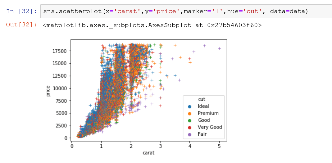
As you see there is a lot of data here and the style of the individual dots are too closely fixed on the graph to see clearly so lets style the plot by changing the marker used to describe each individual diamond. To change the marker you simply need to add the marker parameter to the code. In the plot below, I am adding “+” as my marker with marker=”+”.

Change the Color of the Markers
The next step would be to change the color of the markers to get a better understanding of what these closely correlated markers mean. We can use the hue parameter to categorize the markers. Each category will have a color. Naturally, to categorize the data, your data must be either a string or a categorical variable, in this case, we can use the diamond cut quality to produce different categories.
Change the Size of the Markers
You can easily change the size of the markers by adding in the size parameter. You will need to define the size parameter by setting which part of your data is determining the size. In this example. I am going to use the carat to determine the size of the individual markers.

Putting it all Together
Let’s take a look a the final plat and the final code that you need to create the visual below.
#load in the libraries

import pandas as pd
import numpy as np
import matplotlib.pyplot as plt
import seaborn as sns
%matplotlib inline

# load your data

data = pd.read_csv('diamonds.csv')

#create your scatter plot

plt.title('Diamond Price and Carat Size')

sns.scatterplot(x='carat',y='price',marker='+', hue='cut', size='carat',data=data)

BONUS:
Marker Colors
Styling the Marker Colors with the palette parameter. You can choose from all the individual Matplotlib Color Palettes
Plot Background
Change the plot background with the using the plt.style.use() function. You can find a ton of different Matplotlib Style Templates
The final result will look like the plot below:
