

You can easily create a heatmap using the Seaborn library in Python. For this tutorial, I’m going to create this using Jupyter Notebooks. The first step is to load the dependencies which are the essential library. You can also Learn Python Data Insights on YouTube
import pandas as pd
import numpy as np
import seaborn as sns
import matplotlib.pyplot as plt
%matplotlib inline
Now that we have the essential libraries, lets load in your data set and save it as a variable called df. My data is saved as a CSV. I am going to use Avocado prices I download from Kaggle’s data library.
df = pd.read_csv('avocado.csv')
How does Seaborn Heatmap work?
This heat map works by correlation. This shows you which variables are correlated to each other from a scale of 1 being the most correlated and -1 is not correlated at all. However, you cannot correlate strings. You can only correlate numerical features. Don’t let this stop you because you can always encode your categorical data types using the get_dummies function in Pandas library. I am adding the figure size so that we get a bigger image. You can do this by adding plt.figure() function.
plt.figure(figsize=(10,5)
sns.heatmap(df.corr())

Once you have the heat map created, let’s make it more actionable by changing the styles. Add correlation numbers to get a better understanding of it. You can do this by adding the annot parameter which will add correlation numbers to each cell in the visuals.
sns.heatmap(df.corr(),annot=True)

We can style this further by changing the figure size and colors. To do this you will need to use Matplotlib figure function.
plt.figure(figsize=(9,5)
sns.heatmap(df.corr(),annot=True)

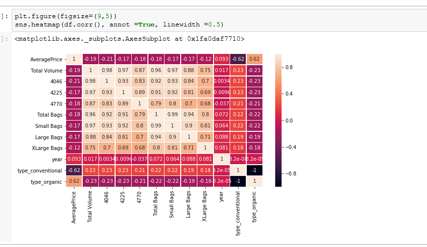
Add Lines between the correlation cells
plt.figure(figsize=(9,5)
sns.heatmap(df.corr(),annot=True, linewidth=0.5)

Lastly, you can alter the colors of your heatmap by utilizing the cmap parameter. You can Google the Seaborn color palette to see what is available. I’m going to change this to the coolwarm palette. Here is a great resource for colors
plt.figure(figsize=(9,5)
sns.heatmap(df.corr(),annot=True,linewidth = 0.5, cmap='coolwarm')

Check out the Video on Seaborn Heatmap Creation in Python

Learn how to create Subplots.
