Gender Income Gap Data from The Bureau of Labor Statistics
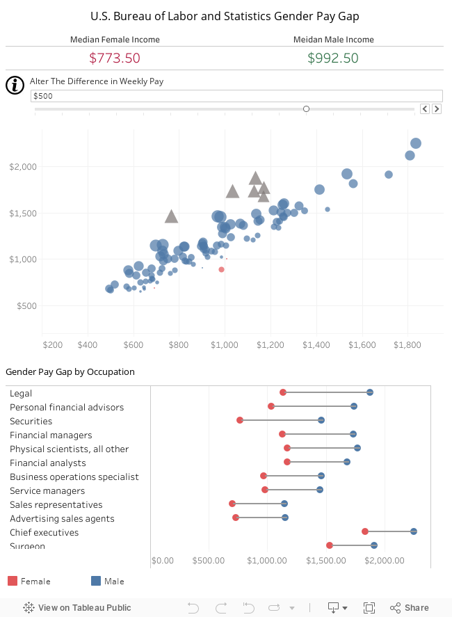
The data was sourced from the open data from Bureau of Labor and Statistics. The data can be found at bls.gov. The data can be downloaded in the form of CSV. This data was then imported into Tableau to visualize the data.
Just a note on the this analysis. This is pure data presented in Tableau without any opinion or conclusions. So many variables are not considered that may have a significant impact on the analysis of the results. These variables range from maternity leave, hours worked and elements of the sample. Additionally, this data is compiled weekly and the income is prior to taxes.
How these visualizations were made.
Side by Side Bar Charts
1. The data was imported into Tableau as a CSV
2. For the bar charts, the occupation dimension was placed on the dimension shelf.
3. The male and female weekly income measures were added.
4. The marks were changed to side by side bar charts.
5. Occupation was placed on the Filter with condition of no NULL data.
6. A calculated field was created by subtracting avg male income from avg female income. Change to a percent and add to lables.
7. Duplicate this sheet and change the marks to scatter plot
9. Create a calculated field where Male Weekly Income > Female Weekly Income.
10. Place this on the color shelf.
Male and Female Average Weekly text comparison
1. Add average weekly income measures (male and female).
2. The marks were changed to Text.
3. Occupation was placed on the filter.
Create a Dashboard
1. Place all the sheets in a dashboard.
2. Use the the scatter plot as filter for the text comparison chart.
Hate Crimes Across the United States.
See All My Visualizations on Tableau Gallery