How To Make Box And Whisker Plot Excel
A Box and Whisker Plot might sound fancy, but it’s essentially a chart that shows you how data points spread out across a range. Imagine lining up all your data points from smallest to largest.
This plot helps you see where most of the data clumps together, where the middle point is, and if there are any data points that stand way outside the group, which we call outliers. It’s like looking at a group photo where you can quickly see who’s the tallest, the average height, and if someone is standing far away from the group.
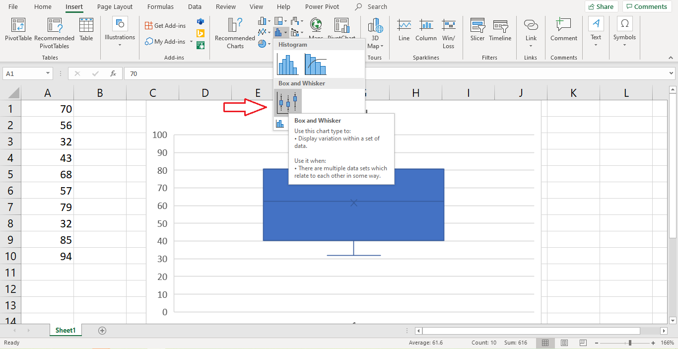
A box plot, also known as a box and whisker chart, visually represents data using a method called the six-number summary.
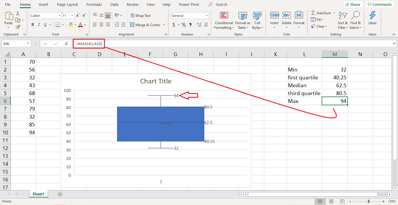
- Minimum Value: The bottom whisker marks the minimum value and this is the smallest number in your dataset.

Note: The minimum value is the same as using the Min function. In this example, the minimum value is 32.

- Maximum Value: The top whisker signifies the largest or maximum value in the dataset.
Note: This can be calculated with the max function. In this example, 94 is the maximum value.
- Median: The line within the box refers to the median value. This is the middle number of your dataset, effectively dividing it into two halves.
Note: You can calculate this with the median function. In the example shown below, the median value is 62.5.

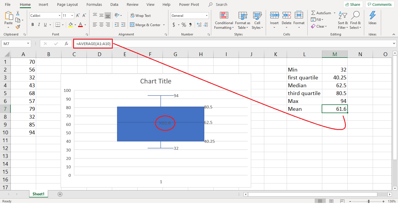
- Mean: By default, MS Excel adds an X symbol onto the plot. This marks the value of the mean or average value from the dataset.
Note: To calculate this, you need to use the average function.
- First (Lower) Quartile: The bottom of the box marks the location of the first quartile or 25th percentile. By default, MS Excel creates a box plot based on quartiles that were calculated with the median excluded, also known as “Exclusion Median”.
Imagine splitting the lower half of your data (below the median) to find its middle value. That’s the first quartile.

Note 1: If you want to calculate this manually, then use quartile.exc function.
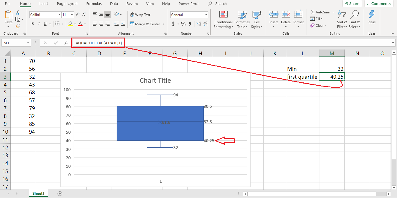
Note 2: If you prefer to calculate the quartiles with the median included, known as “Inclusion Median”, then you use the quartile.inc function instead.
- Third (Upper) Quartile: The top of the box marks the location of the third quartile or 75th percentile Similarly, this is the middle value of the upper half of your data (above the median).
Note: This is calculated in the same way as the first quartile, but this time you add the number 3 into the second part of the function.

Additionally, box plots often feature “whiskers,” which are lines that extend from the box to show the variability outside the main cluster of data, indicating the range beyond the quartiles.
When Would You Use a Box and Whisker Plot?
This plot comes in handy in various scenarios:
- In Finance: It’s used to compare how different stocks have performed over time, showing not just the average returns but how risky they might be.
- In Healthcare: Doctors might use it to understand the range of blood pressure readings among patients of different ages.
- In Research: Scientists use it to compare measurements from different experiments to see if there’s a consistent pattern.
- In Quality Control: Manufacturers use it to make sure all the products they make are about the same size, weight, etc., spotting any that are way off.
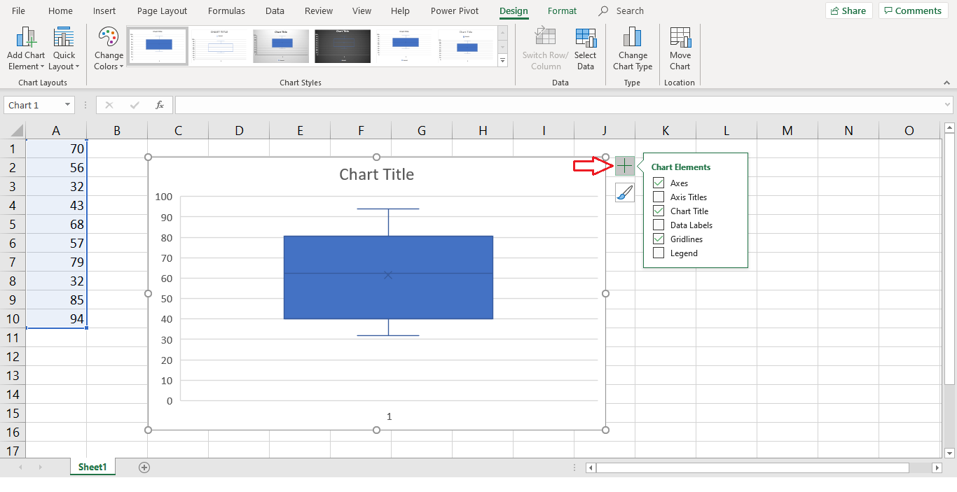
How to Create a Box and Whisker Plot in Excel: Step-by-Step
- Open Excel and input your data into a single column for a basic plot or multiple columns for comparing different data sets.
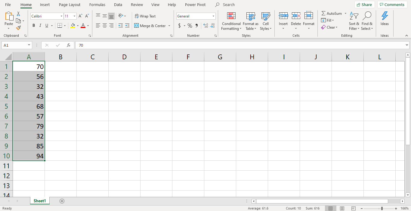
- Highlight the Data you want to include in your plot.
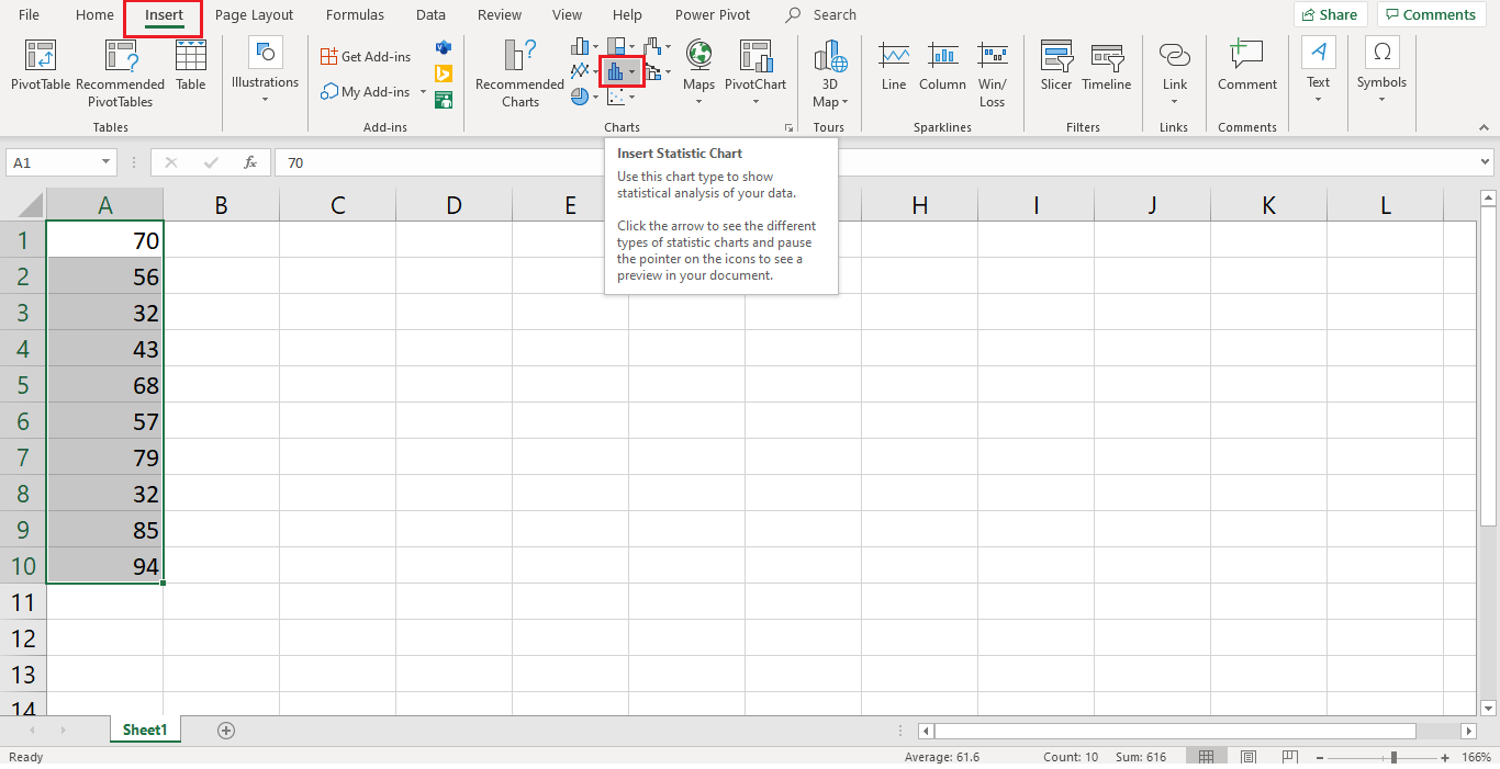
- Go to the Insert Tab, find the “Charts” group, and click on “Insert Statistic Chart” or similar.
- From there, select the “Box and Whisker Plot” option.
- Customize Your Chart as needed by right-clicking on elements of the chart and selecting the appropriate options from the context menu.