F.B.I. Hate Crime Statistics — Visualization
How I made this Viz:
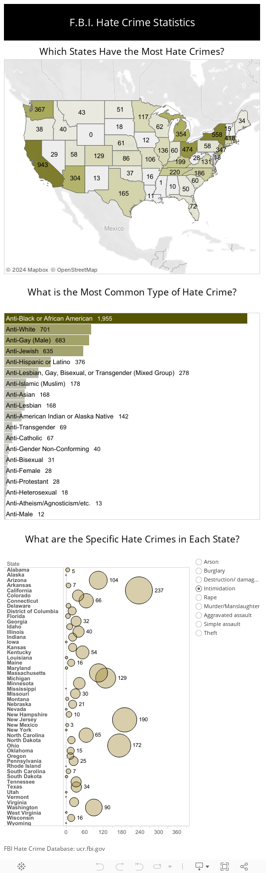
This was a very easy viz to make because there were no parameters or calculations. It was made purely with two essential sheets. One for the Map and the other for the bar chart. I made this by searching the net for hate crime statistics. I ended up finding the government database for hate crimes. This is known as the UCR FBI. There are several tables with with the most up to date being in 2014. I downloaded the hate crimes statistics in an excel spreed sheet. After the cleaning up the formatting. I placed this in Tableau
Map Visualization:
This is a easy viz. The strings associated with states names were formatted for the map. I put the state names and columns and number of offenses in row. This created a Geo Map. I changed the geo map to a filled map. Then I placed the total offenses measure in the color mark. Lastly, I placed the sum of the number of offenses on the labels mark.
Bar Chart.
I downloaded the table from the database that listed the most common offenses and victims. I placed the group characteristic in the column shelf and number of offenses in the row shelf. I created a filter and limited the data to only the top 25. I organized the bar from highest to lowest. Next, I eliminated the title and the headers so that no names were visible. Lastly, I added the sum of offenses and the group characteristics name to the labels.
See Other Vizzes
Time Spent in Daily Activities by Race, Weight and Gender