Power BI Dashboard in 10 minutes
Create a Power BI Interactive Dashboard in Minutes
Microsoft Power BI is not a difficult business intelligence tool to adopt. So, I have decided to challenge users to create a Power BI dashboard in ten minutes. In this lighting fast tutorial, you will load, clean and visualize data in ten minutes which will culminate into an interactive dashboard.
How to Load Data( 1 to 2 minutes)
Power BI has the ability to load a plethora of different data sources. For the most analyst, you will be loading a spreadsheet in the form of an Excel or CSV. For the most part, this data comes clean and easy to upload. However to keep it interesting and to ensure we are all using the same data sources. Let’s load an excel workbook with the top-grossing movie in them. To learn more about load data from the web, check out Scrape a Website with Power BI and Excel
- Click Get Data
- Choose Excel
- Select the Excel sheet that you want.
- Look at the preview window, if the data is in the correct format, go ahead and load it. However, if there are issues with the structure, you should edit prior to loading.

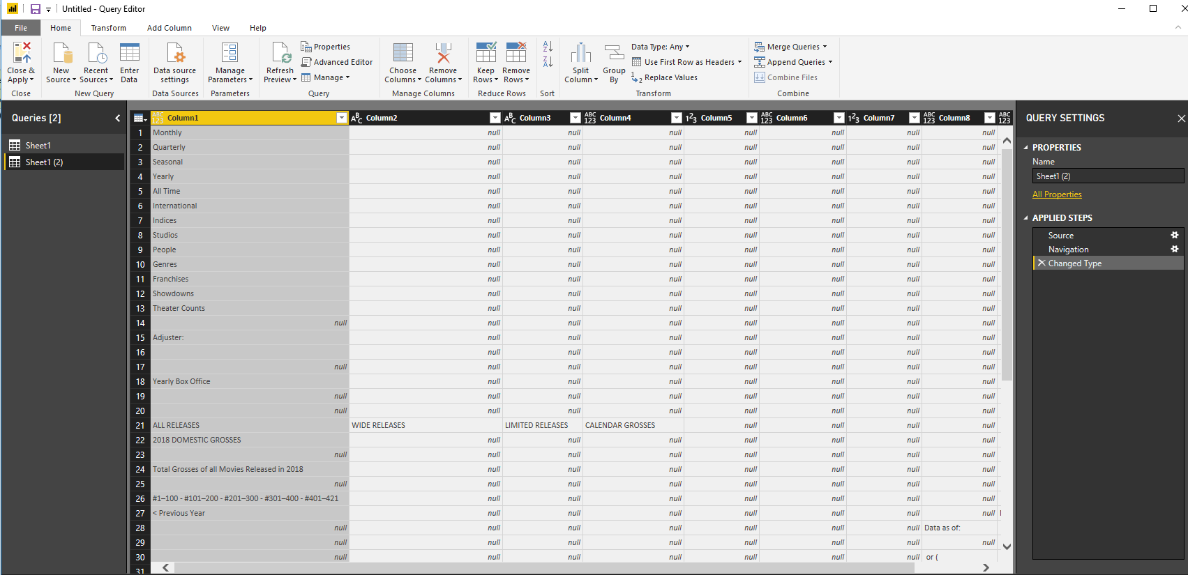
How to Clean Your Data (5 minutes)
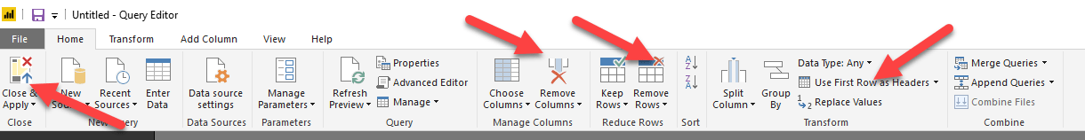
One of the best things about using Power BI is its ability to preprocess the data prior to loading it into your data model. This is something that usually requires a separate tool such as python, Alteryx or the new Tableau Prep.
- Select Edit in the Data Preview window.
- Click Remove Rows, choose 9 rows to clean.
- Remove Column 1 and 7
- Promote the first row to your headers by clicking Use First Row as Headers
- Rename Your 1st column to Title and 4th column to the theater.
- Highlight Total Gross, and change it to a number instead of general.
Visualize your Data( 3 t0 5 minutes)
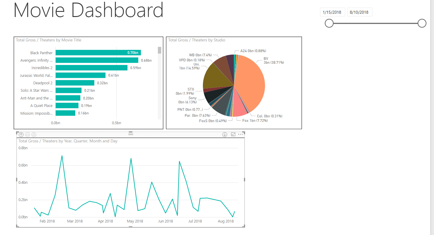
This is the easy part. You can visualize your data quickly into an interactive dashboard so that your end user can slice and dice the data to their needs. We are going to make 3 chars with a slicer for title studio and date. We will make 3 charts. A bar chart to display the total grosses for movies by title, a pie chart with the total gross per studio and a line chart showing the grosses over time.
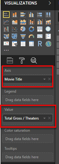
Create A Bar Chart Movie Titles Gross Totals
- Click the Bar Visual in the right-hand Visualization pane.
- Add Movie Title as your Axes
- Place Gross Total in the Value section
- Sort the graph by Gross Total
- Add Data labels by clicking the Paint Roller and changing Data Labels to ON


Create A Pie Chart of Studio Gross Totals
- Click the Pie Chart in the right-hand Visualization pane
- Place Studio in the Legend
- Put Gross Total in the Values
- Add data labels by Clicking the Paint Roller and clicking Details labels to ON

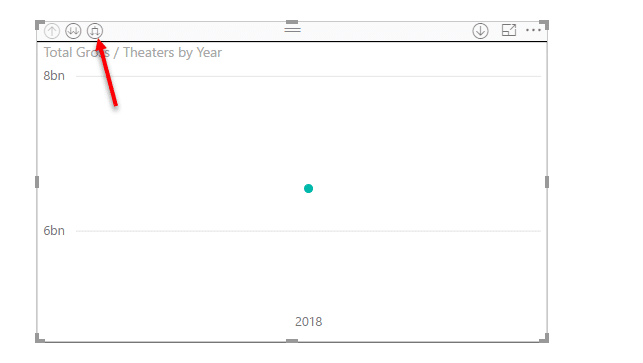
Create a Line Chart
- Click the Line Chart from the Visualization Pane
- Put the data value in the Axis
- Place Total Gross in Values pane
- Click the hierarchy drill on the visuals to drill down to the day level.

Add a Date Gauge.
- Choose the Slicer visual from the right side Visualization Pane.
- Add the date value to create a gauge.