How to Create an Excel Step Chart
A step chart is a great way to show how there has been a significant increase at a period of time. When simply using a line chart in Excel the data is naturally going to trend from one point to the next. This action creates a slope. As opposed to, a stepchart that will show a literally step from point to point. Let’s take a look at the different.
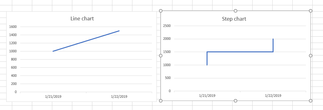
What is the difference between a line chart and a step chart
Line Chart
As you can see in the line chart is composed of a single value at a period of time.
Step Chart
A step chart is composed of 2 values at a single point in time.
How to Make a Step Chart
So in order to make a step chart, you need to create two values at a certain date. Let’s follow the instructions below or check our video:
Create a second data table:
- Copy the headings of existing table data to create a second table.
- Move one space down, leaving one empty space between your heading and next data point.
- Use the second date in our data and add the first value in your data.
- Copy the data down by double-clicking plus sign or dragging the data down.
- Now copy your original data and paste it under the second data table.
- Highlight your new second table and insert a line chart.

Take the second date and the first value

Copy the data down into the end of the first data set.

Once you have the copied data. You have two points at a single point in time which creates a step.
